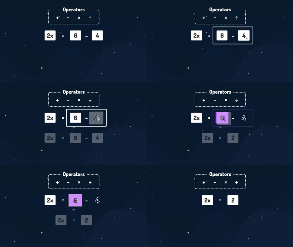
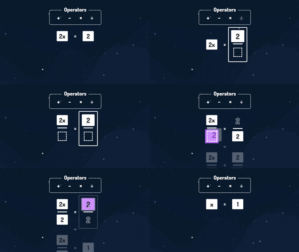
Design
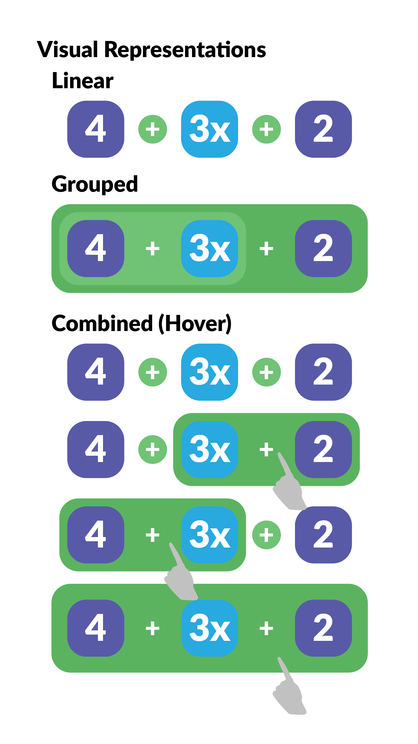
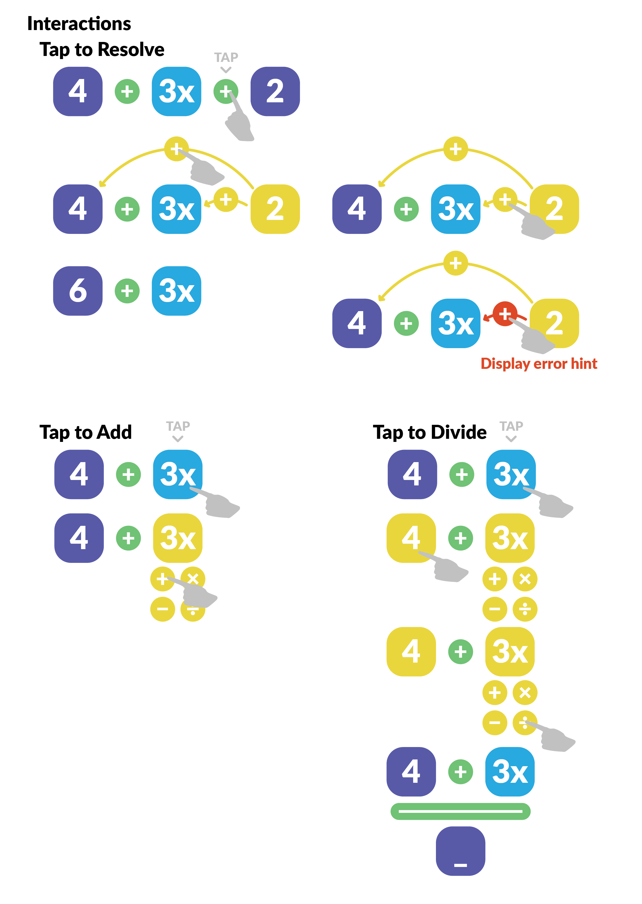
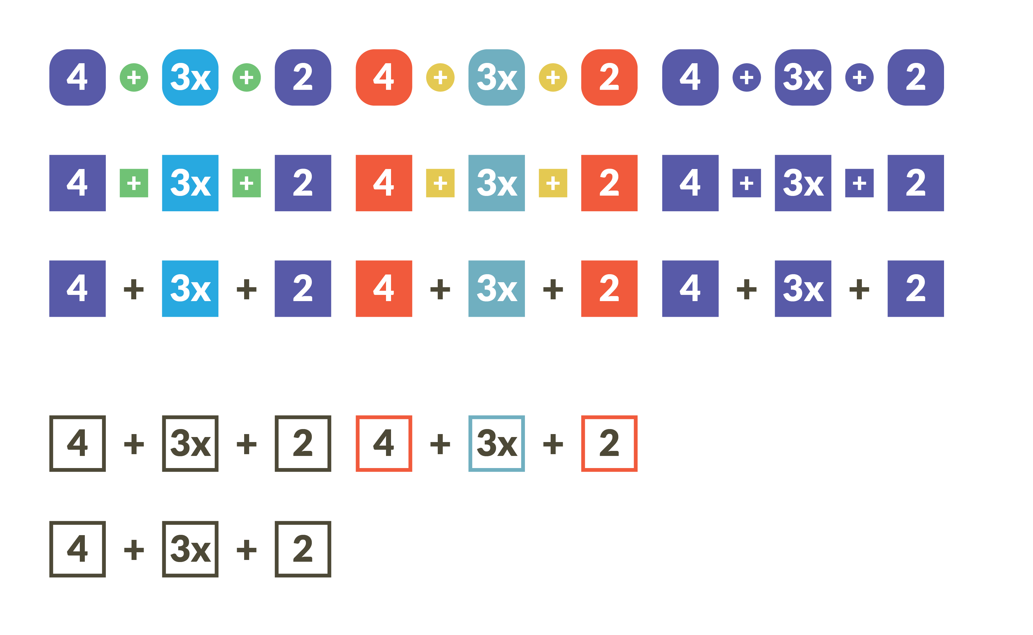
Here are graphics I designed during the prototyping phase. Figure 1 shows potential interactions on and visual representations of expressions, Figure 2 shows possible aesthetics the equations could have, and Figure 3 shows how the overall interface would be structured, with the equation in the center, and the operators above in a box. I needed to make sure that all the draggable elements looked draggable immediately, so I decided to emulate child-oriented interfaces like Scratch and make each element a colored block.
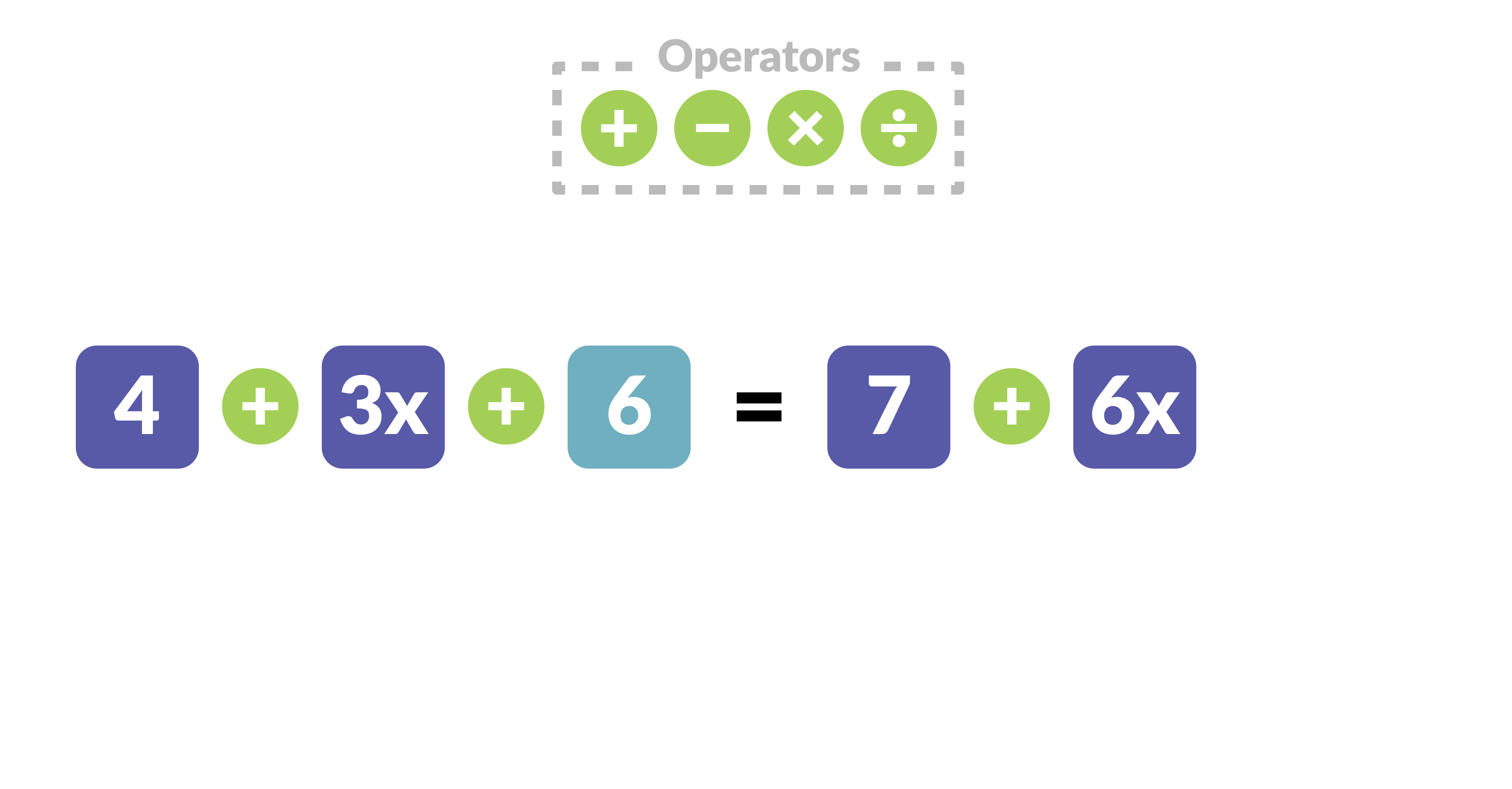
As you can tell from the final images, the boxes were kept for the numbers, but not operators. That's because we found that boxed operators just didn't read as well as unboxed, and putting the operators in their own partition on the screen (kind of like one might put their pencils and erasers on their own desk) was a sufficient hint that they were interactable.
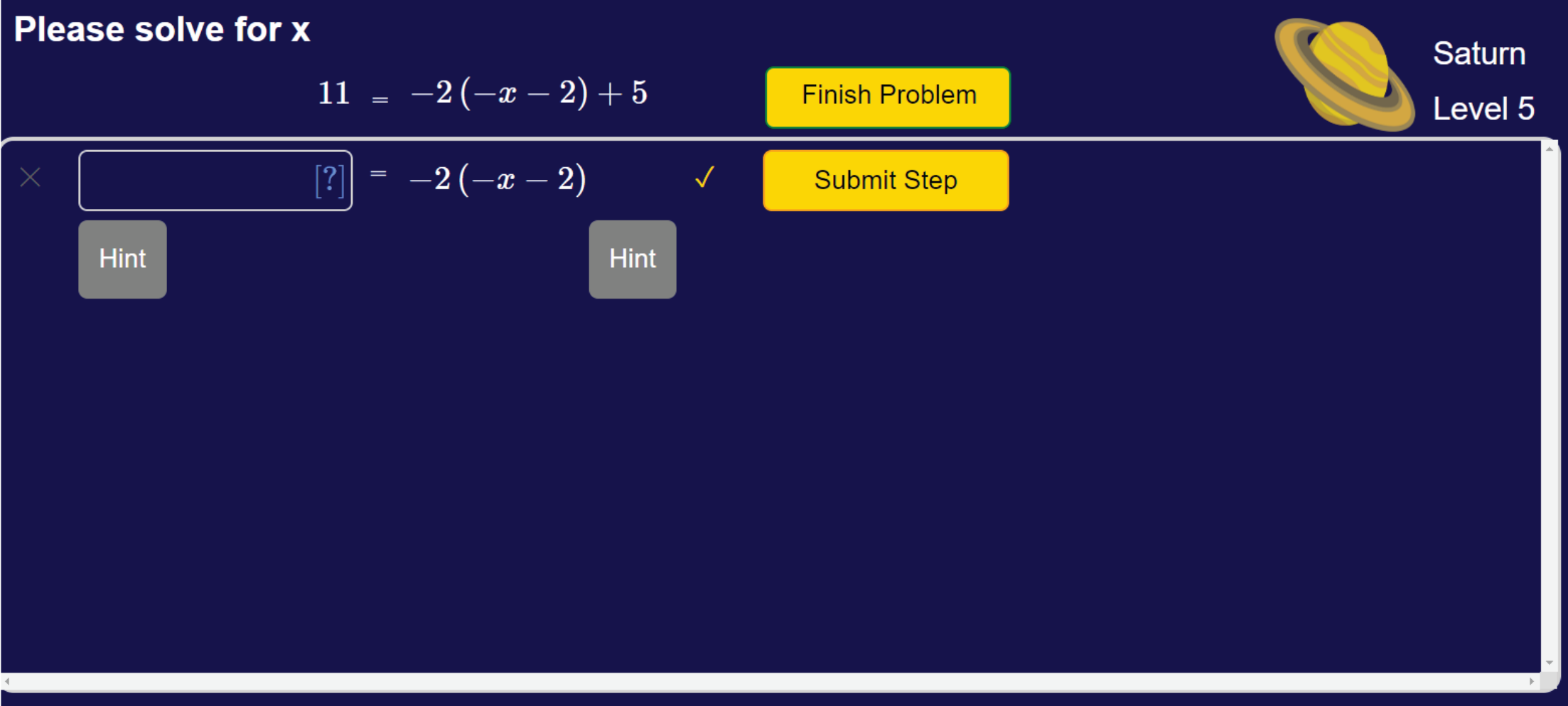
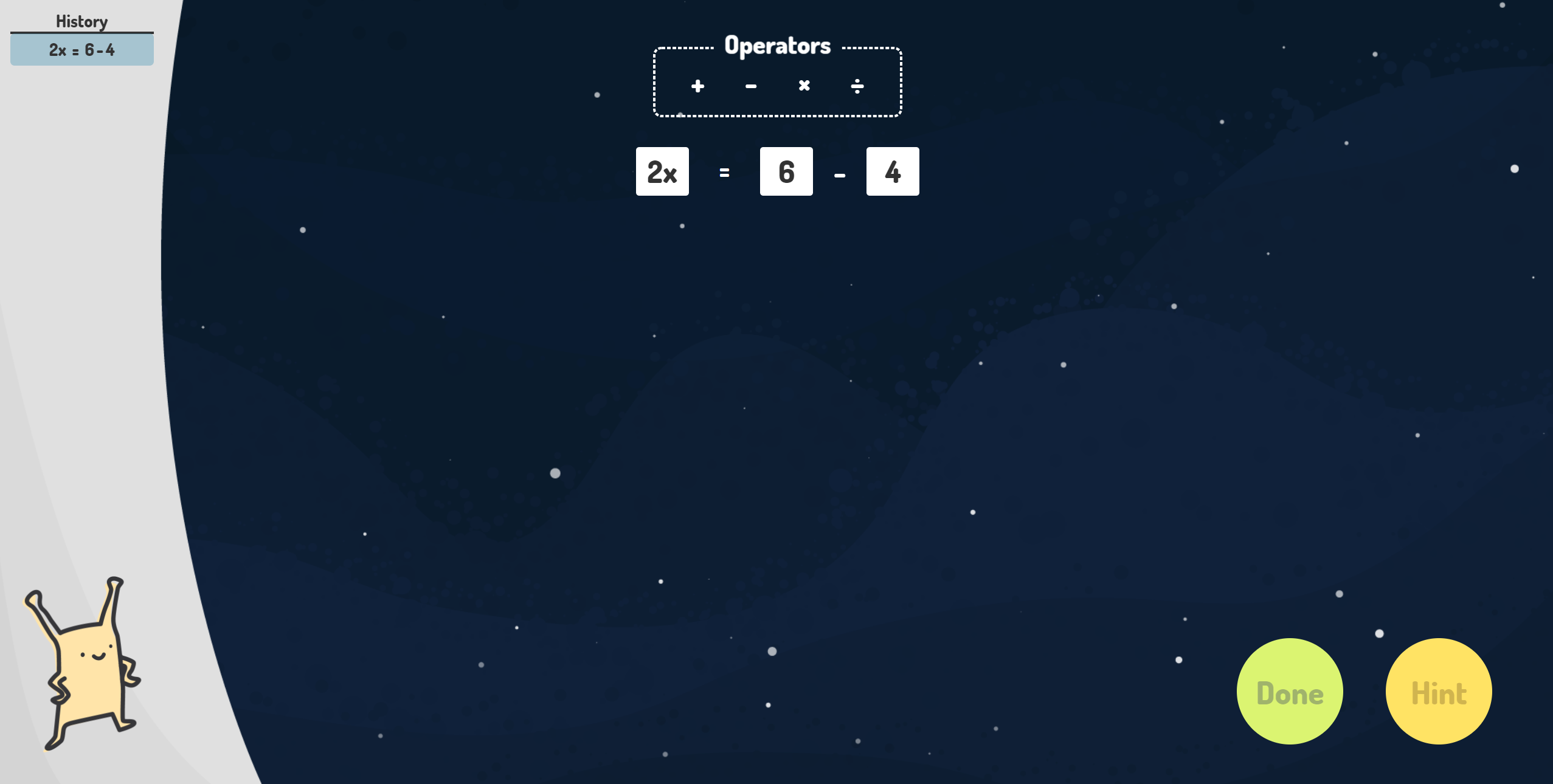
The idea for the space aesthetic came from the Lynnette team. They're working on upgrading the aesthetic of their math interfaces, and when I was recruited, it looked like does Figure 4 on the right. While the theme intrigued me, I thought the overall interface was rather utilitarian, so I created art assests that were a little more visually interesting without being distracting.

The alien came from the project’s website, however, it was my idea to use it in the application itself. For such a cute little critter, it wasn’t being used anywhere. My understanding was (and still is) that children tend to respond better to having a character present them information than just presenting them the information outright, so I decided to replace Lynnette’s error and hint feedback component with the alien and a dialog box.
Structure
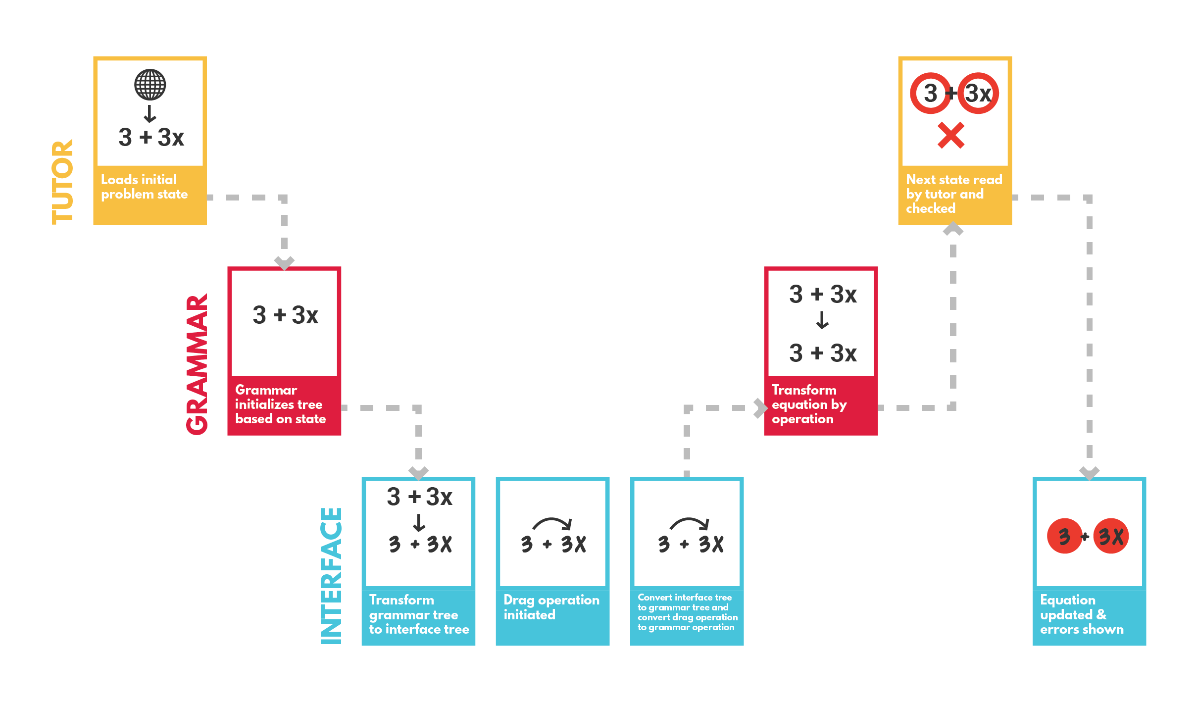
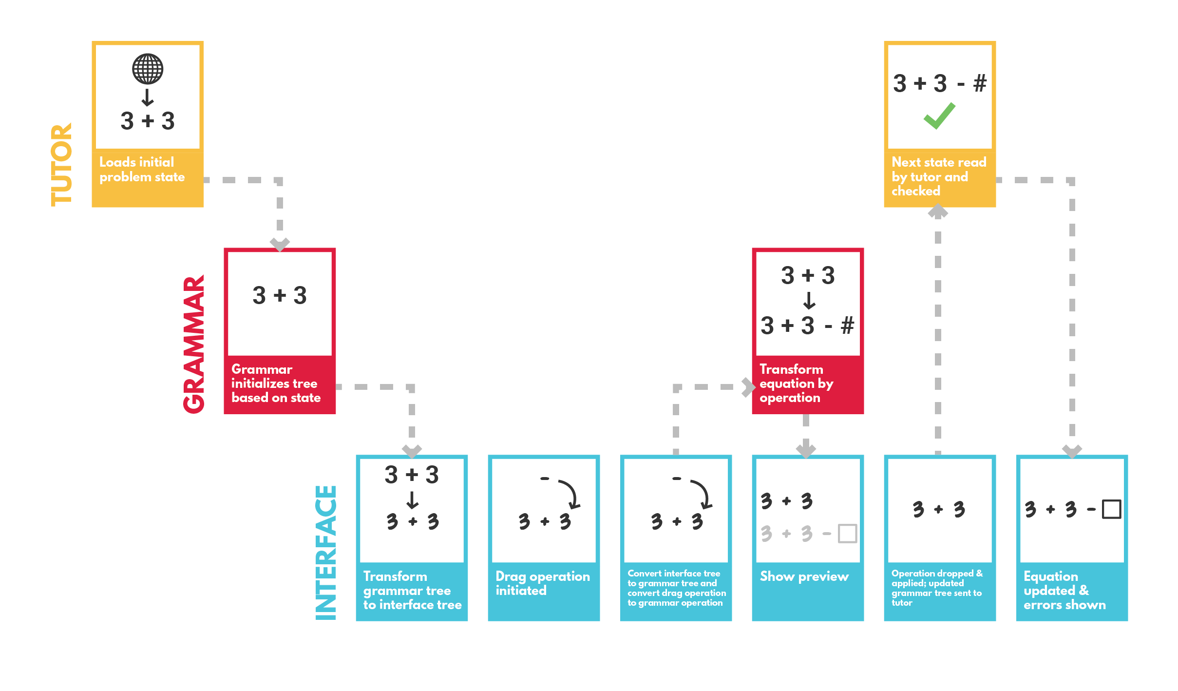
Figure 6 shows a visual aid I designed in Illustrator that I used to organize my thoughts and describe to others how the backend of the application would interact with the frontend. To explain some of the jargon: the tutor is Lynnette’s existing intelligent feedback system that assesses the accuracy of inputs and the Grammar is a parser that can apply operations to equations (you’d be surprised how tricky it is to represent all of algebra in code).
The choice of Svelte as the UI framework was critical to the success of this project. Normally I wouldn’t dwell on the choice of UI framework, because usually it just comes down to personal preference, but I chose Svelte because it was the only UI framework I knew that compiled down to normal javascript. This was essential because Lynnette’s backend can’t run the kind of Node server that a framework like React requires. Initially, my only option was to use static html with jQuery, which while doable, doesn’t allow for the kind of hierarchical structure that a UI framework provides.
Results
A research partner and I tested the interface prototype with children in the target age group, and the results were surprisingly positive. We sat them in front of the app and initially gave them no instruction about how to use it. The kids understood the interface immediately, knowing which elements were draggable and what was happening algebraically. The only difficulty they had was figuring out how to resolve operations (add/subtract/multiply/divide numbers), but once we told them that you just had to drag one number over another, they were perfectly comfortable with all the interactions.
In fact, both kids suggested that we implement features which we had come up with during the prototyping process, but left on the cutting room floor. For example, they wanted the ability to click on the history to return to previous states in the equation and proceed from there, and we actually had this functionality throught most of the prototype, but had to drop it because the tutor backend couldn't easily handle going back to different parts of the problem.
